Torus Tech Branding
For this branding redesign, I was assigned Torus Tech, a company that is researching the effect of electromagnetized quartz crystals as an energy source, among other things. I took the crystal motif and a couple shades of green, representing sustainability, to create a new logo and brand guidelines.
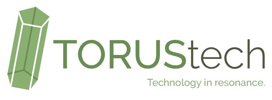
Logo
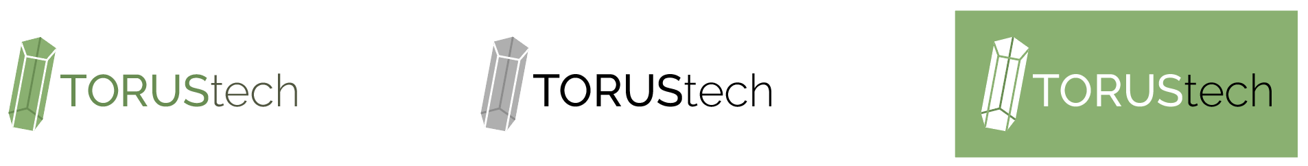
The green crystal is Torus’ logomark, paired with the Torus Tech logotype. These two elements should not be used separately from one another.
Variations
The logo may be used in black and white, or on a colored background. Other colors may be used but green is preferred.
Clearance
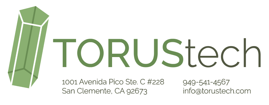
Capital T should be used to determine correct spacing around the logomark.
Logo should not be under two inches in length.
Additions
The Torus Tech tagline or address may be placed within the clearance guidelines if necessary. Be sure to leave one line-height between the logotype and these elements.
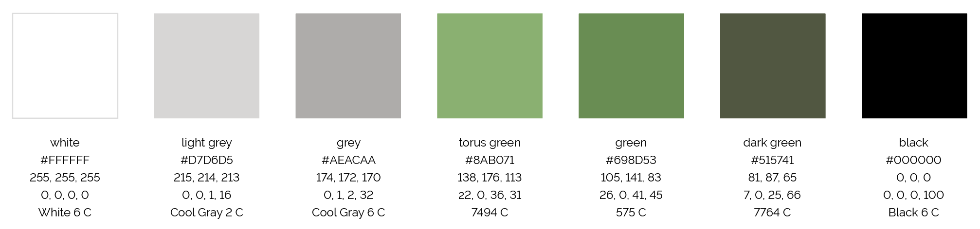
Colors & Patterns
Dominant colors used in the logo are green & white.
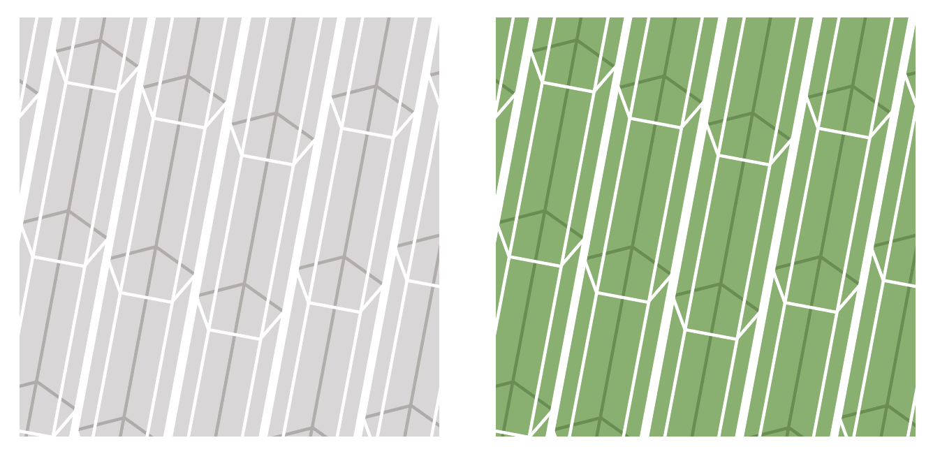
Crystal patterns may be used in grey or green.
Grey pattern may be used under logotext only when the text is more than five inches in length to preserve clarity.
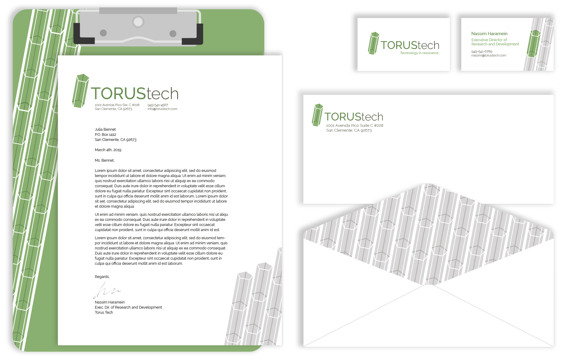
Brand In Use
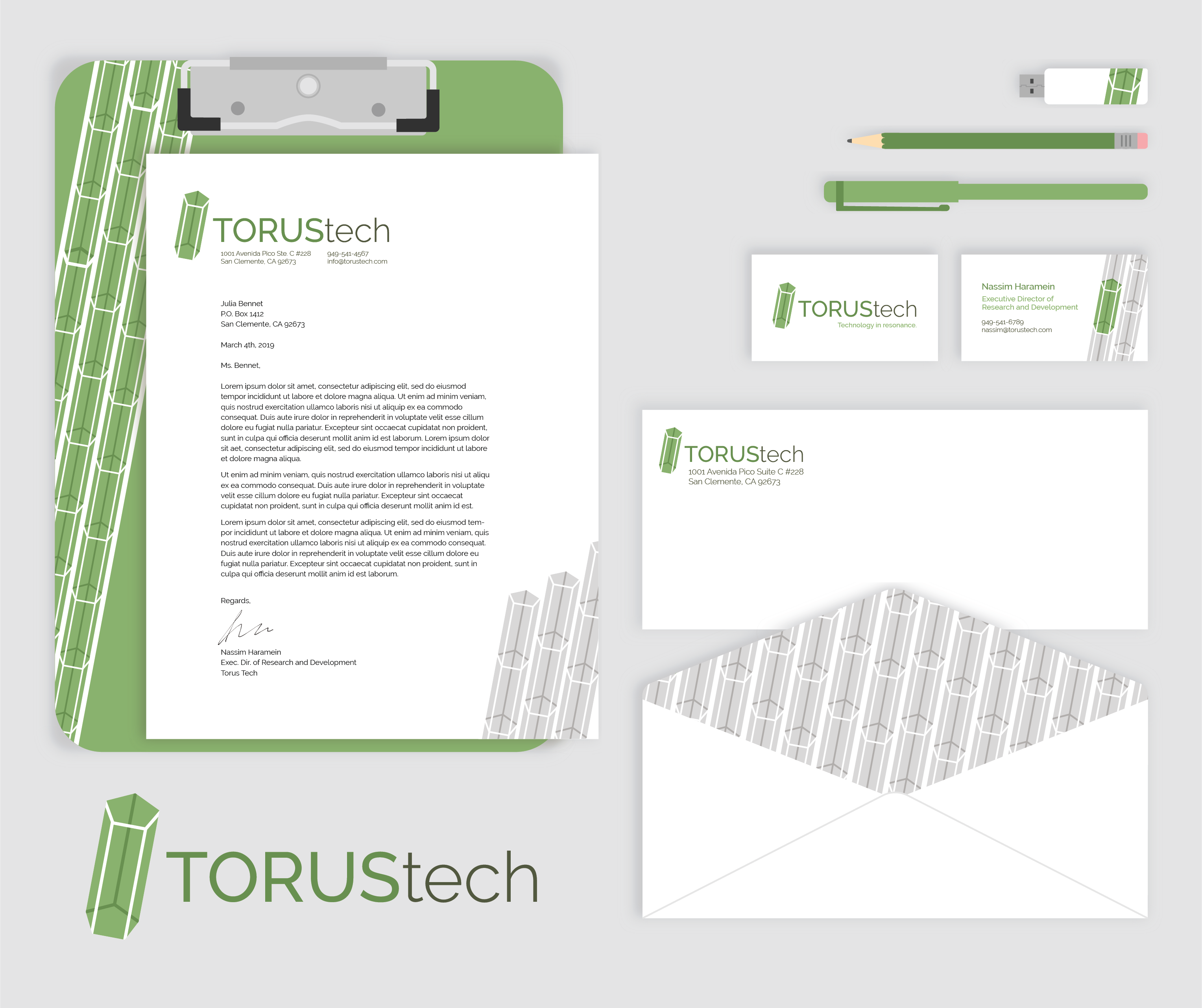
Stationery
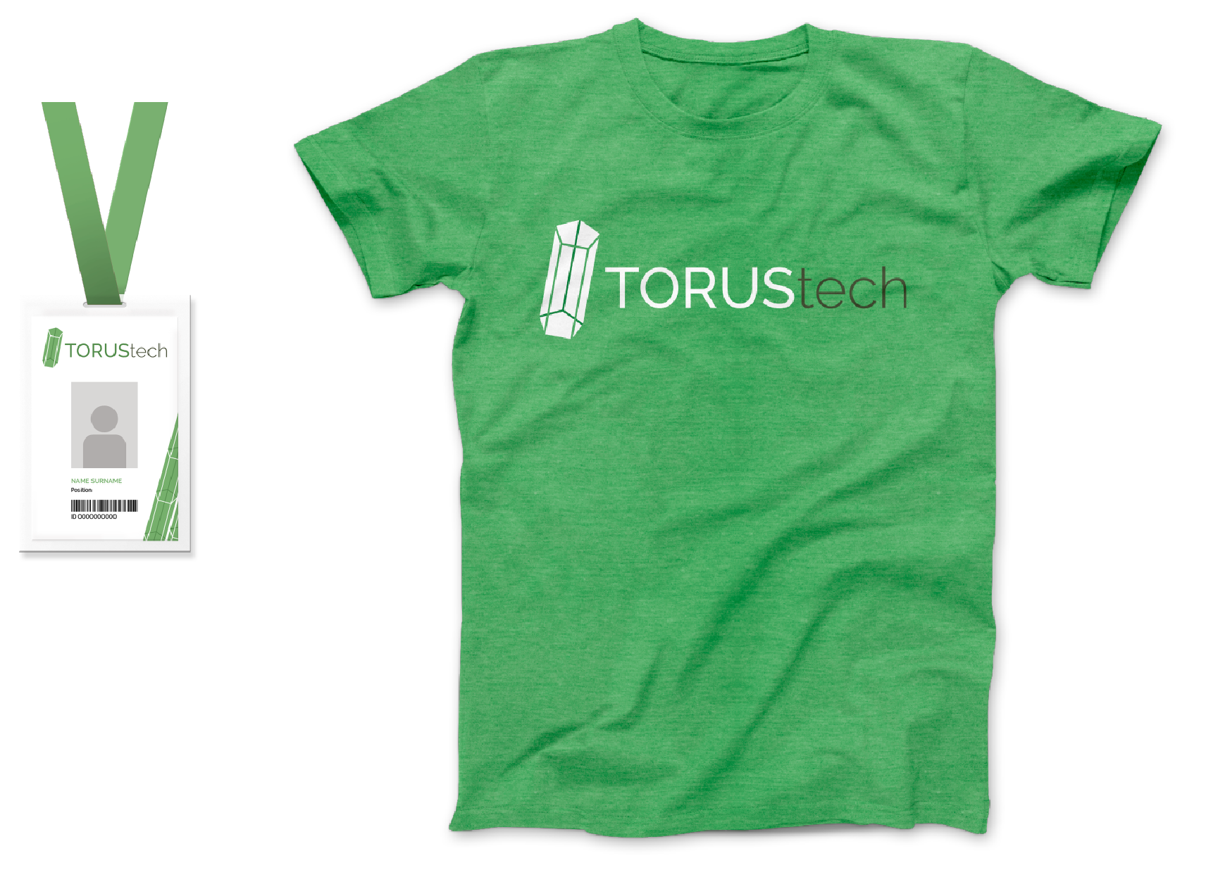
Wearables
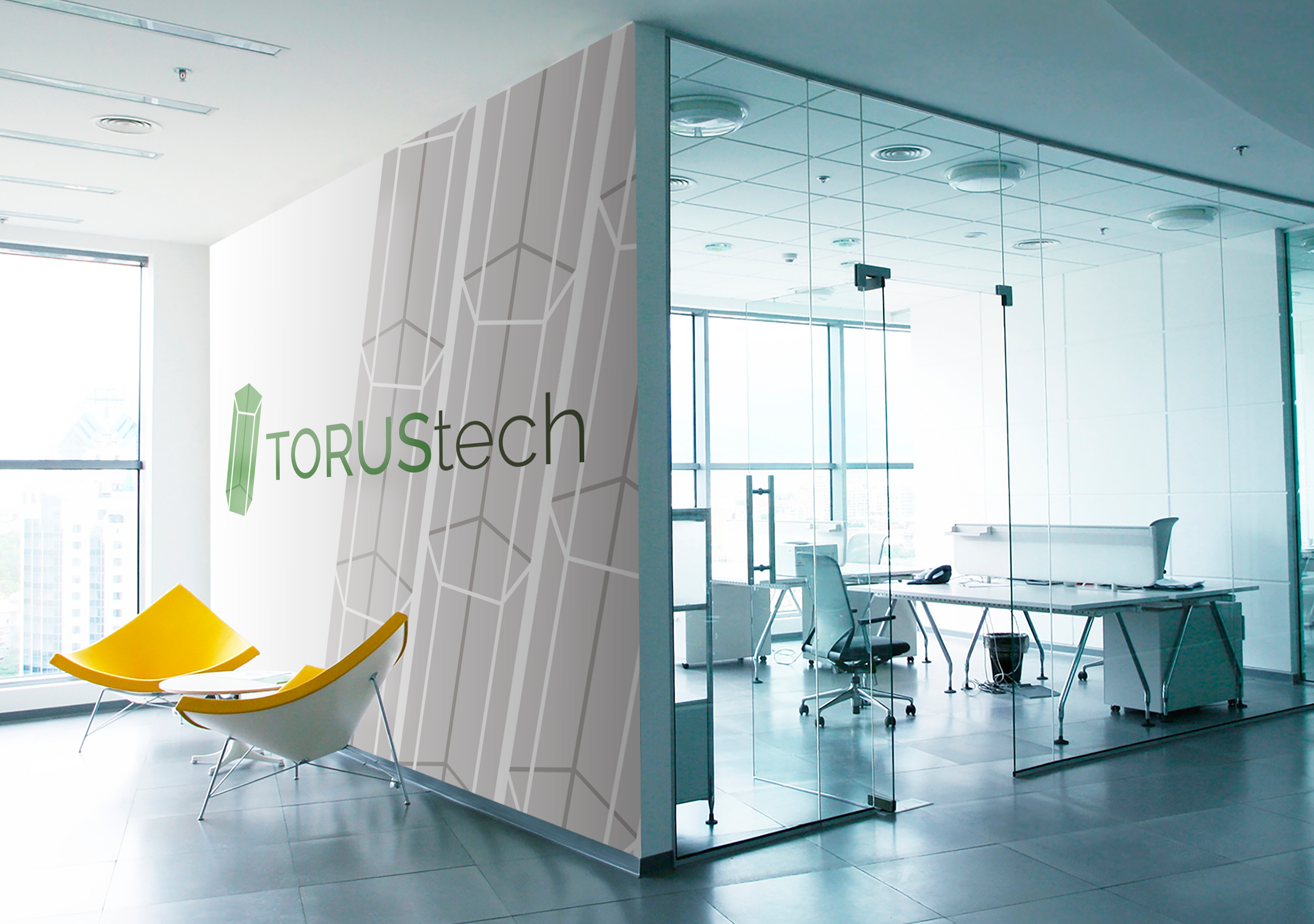
Office Spaces